
Toolbar
The Toolbar is the horizontal bar at the top of the drawing interface. It provides quick access to all tools and common actions organized into logical groups.

Toolbar Layout
The toolbar is divided into button groups separated by visual dividers:
Button Groups
Navigation Group
| Button | Icon | Shortcut | Description |
|---|---|---|---|
| Home |  | Home | Return to Start Screen |
| Reload |  | F5 | Reload current project |
| Import |  | Ctrl+O | Import project from file |
| Export |  | Ctrl+S | Export project to file |
Edit Group
| Button | Icon | Shortcut | Description |
|---|---|---|---|
| Undo |  | Ctrl+Z | Undo last action |
| Redo |  | Ctrl+Shift+Z | Redo undone action |
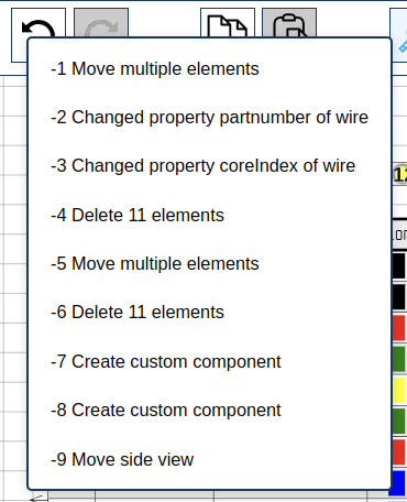
Undo/Redo History Menu:
 click Undo or Redo button to see recent actions:
- View up to 10 recent operations
 click any item to jump to that state
- Named revisions appear in bold — these are checkpoints created manually via script or automatically before each script execution
Clipboard Group
| Button | Icon | Shortcut | Description |
|---|---|---|---|
| Copy |  | Ctrl+C | Copy selected elements |
| Paste |  | Ctrl+V | Paste copied elements |
Copy behavior:
- Copies selected elements to clipboard
- Maintains relative positions
- Works across sheets
Paste behavior:
- Activates paste mode
- click to place at cursor position
- Press Escape to cancel
Selection Tools Group
| Button | Icon | Shortcut | Description |
|---|---|---|---|
| Hand |  | Escape | Select, inspect, and move elements |
| Eraser |  | Delete | Delete elements |
:- Default selection tool
- click to select single element
- Drag for box selection (left-to-right selects elements fully inside, right-to-left selects overlapping elements)
- Ctrl + click for multi-select
- Drag selected elements to move
- Arrow keys to move selected elements (hold Shift for 10px, Ctrl for grid step)
- Selected element opens in Inspector
- Selecting a single resizable element (Rectangle, Circle, Image, Sideview) shows blue resize handles — drag to resize, hold Shift to lock aspect ratio (see Resizing Elements)
- Selecting an Image or Sideview also shows a circular rotation handle above the element — drag it to rotate freely on the canvas (see Rotating Elements)
:- click element to delete
- Drag for box selection deletion
- Alt + click for immediate delete (no selection)
Drawing Tools Group
| Button | Icon | Shortcut | Description |
|---|---|---|---|
| Dimension |  | Alt+D | Draw dimension annotations |
| Bundle |  | Alt+B | Draw wire bundles |
| Bundle Splice |  | - | Create bundle splice |
| Wire |  | Alt+W | Add wire to bundle |
:- click first point
- click second point
- Dimension line appears with measurement
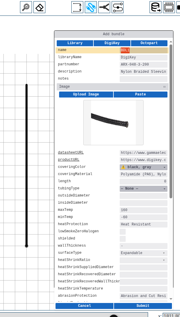
:- click start point
- click intermediate points (optional)
- double-click or Enter to finish
- A properties dialog opens — set name, sleeving type, and other manufacturing properties. Use the DigiKey or Octopart button to import specifications from a part number.
 :
:- click on a bundle anchor point
- Fill in the splice properties dialog (name, part number, appearance). The dialog includes DigiKey and Octopart buttons to import splice specifications.
- Submit to place the splice
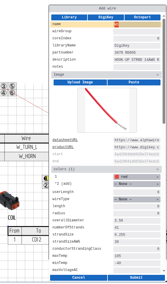
:- click on component wire table or pinout
- click on bundle
- click on destination component/pin
- A properties dialog opens — set name, color, gauge, and other wire properties. Use the DigiKey or Octopart button to import wire specifications.
Components Group
| Button | Icon | Shortcut | Description |
|---|---|---|---|
| Library |  | Insert | Place component from library |
| Custom |  | Ctrl+Insert | Create custom component |
| Terminal |  | - | Create terminal component |
Library Component:
- Opens component library browser
- Select component from available libraries
- click canvas to place
- click while the ghost is following the cursor flips itsorientation; the Flip component checkbox in the sidebar Library tab reflects the current state
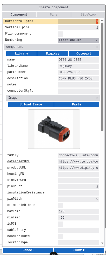
Custom Component:
- Opens component creation wizard
- Define pins, properties, appearance
- The wizard includes DigiKey and Octopart buttons to populate component and pin properties from a part number
- click while the ghost is following the cursor flips itsorientation; the Flip component checkbox in the creation dialog opens pre-set to match
- click canvas to open the wizard
- Chain placement: after you submit one component, the next placement opens the dialog pre-filled with the same values - manufacturer, partnumber, manufacturing fields, pin configuration, and sideview image all carry over; only the component name is regenerated. Press Submit again to chain identical placements, or tweak any field first. Switching to another tool clears this carry-over.
Terminal:
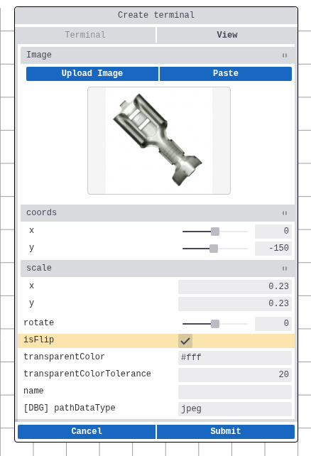
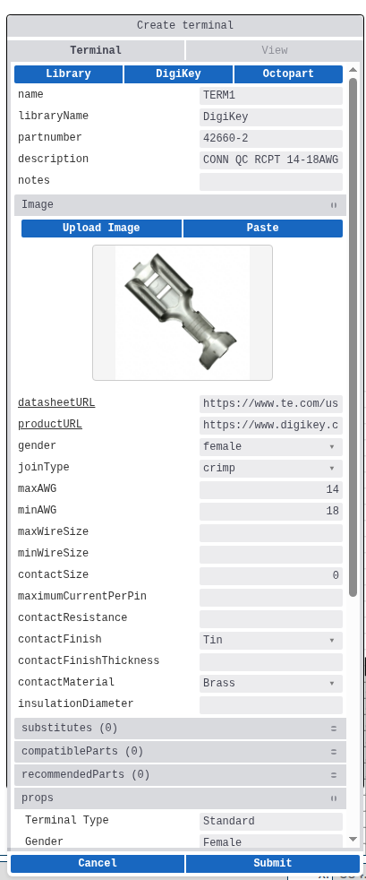
- Opens a terminal creation dialog
- Set pin properties (name, part number, gauge)
- Use the DigiKey or Octopart button to import pin specifications
- click while the ghost is following the cursor flips itsorientation; the Flip terminal checkbox in the creation dialog opens pre-set to match
- Chain placement behaves the same as Custom Component: the dialog pre-fills with the previously submitted values (pin name regenerated) until you switch to another tool.
- Used for external connections
Right-click to flip during placement
For all three component-placement modes (Library, Custom, Terminal), pressing
click while the ghost preview is following the cursor mirrors theghost in place. click then drops the element (or opens the creation dialog) in the chosen orientation. The status line at the bottom of the canvas reminds you of this shortcut while the tool is active.
Chain placement: dialog inherits previous values
While the Custom-Component or Terminal tool is active, the creation dialog pre-fills every placement after the first with the values you submitted previously - manufacturer, partnumber, manufacturing fields, pin configuration, and sideview image all carry over. Only the unique name is regenerated. Just press Enter / Submit to chain identical placements, or tweak any field before submitting. Switching to another tool clears the cache, so re-entering the tool starts fresh.
Bundle placement uses a stronger version of the same pattern: after the first bundle's dialog, subsequent bundles are placed instantly without opening the dialog (only the name is regenerated). Switching pens resets it.
Wires are placed one at a time - the Add Wire tool returns to the Hand tool after each successful wire - so there is no in-tool chain.
Primitives Group
| Button | Icon | Shortcut | Description |
|---|---|---|---|
| Line |  | Alt+L | Draw straight line |
| Circle |  | Alt+C | Draw circle |
| Rectangle |  | Alt+R | Draw rectangle |
| Text |  | Alt+T | Add text annotation |
| Image |  | Alt+I | Import image or SVG |
:- click start point
- click end point
:- Press center point
- Drag to set radius
- Release to create
:- Press first corner
- Drag to opposite corner
- Release to create
:- click placement position
- Enter text in dialog
- Confirm to place
:- Select image file from disk
- click canvas to place
- Supports: SVG, PNG, JPG, BMP, GIF, WebP, ICO, AVIF
Export Group
| Button | Icon | Shortcut | Description |
|---|---|---|---|
| Manufacturing |  | - | Open Manufacturing Data dialog |
Opens dialog with four tabs:
 [Bill of Materials](manufacturing-data.md#bill-of-materials) — complete parts list
  [Wire List](manufacturing-data.md#wire-list) — individual wire routing
  [Wire Cut List](manufacturing-data.md#wire-cut-list) — grouped wire specifications
  [Connectors](manufacturing-data.md#connectors) — connector and terminal summary
Export options include PDF, CSV, SVG, and Excel.
Right Side Buttons
Located on the right side of the toolbar:
| Button | Shortcut | Description |
|---|---|---|
| Help | F1 | Open help documentation |
| Menu | Space | Open Command Palette |
| Profile | - | Open Profile Menu |
Keyboard Shortcuts Summary
Navigation
| Shortcut | Action |
|---|---|
| Home | Project list |
| Ctrl+O | Import project |
| Ctrl+S | Export project |
Edit
| Shortcut | Action |
|---|---|
| Ctrl+Z | Undo |
| Ctrl+Shift+Z | Redo |
| Ctrl+C | Copy |
| Ctrl+V | Paste |
Tools
| Shortcut | Action |
|---|---|
| Escape | Inspection tool |
| Delete | Eraser tool |
| Insert | Library component |
| Ctrl+Insert | Custom component |
Drawing
| Shortcut | Action |
|---|---|
| Alt+D | Dimension |
| Alt+B | Bundle |
| Alt+W | Wire |
| Alt+L | Line |
| Alt+C | Circle |
| Alt+R | Rectangle |
| Alt+T | Text |
| Alt+I | Image |
Tool States
Selected vs Unselected
Active tool is visually highlighted in the toolbar with a blue background.
Enabled vs Disabled
Some tools require specific conditions and appear grayed out when unavailable:
- Wire tool requires bundle to exist
- Paste requires clipboard content

Related Topics
- Canvas - Drawing area where tools operate
- Command Palette - Alternative access to all commands
- Inspector - Edit properties of created elements