
Canvas
The Canvas is the central drawing area where you create and edit your wire harness designs. It provides an infinite workspace with multi-layer support and intuitive navigation controls.
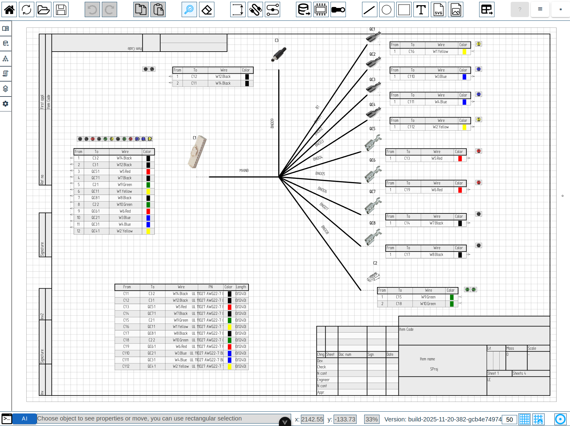
Canvas Layers
LoomCAD uses a multi-layer system to organize different types of elements. Layers are drawn in a specific order, from bottom to top:
| Order | Layer | Contents | Description |
|---|---|---|---|
| 1 | Background | Sheet background | Base layer for sheet color/pattern |
| 2 | Grid | Grid lines | Reference grid for alignment |
| 3 | Stamp | Drawing frame | Title block and border |
| 4 | Bundlelines | Wire bundles | Bundle paths connecting components |
| 5 | Components | Connectors, splices | Electrical components |
| 6 | General | Primitives | Lines, circles, rectangles, text, images |
| 7 | Control | Annotations | Dimensions, leaders |
| 8 | Frozen | Locked elements | Elements protected from editing |
System layers (not user-editable):
- Tooltip layer - hover information
- Cursor layer - custom cursor display
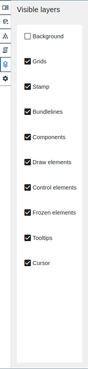
Layer Visibility
You can show or hide individual layers:
- Open Side Menu → Visualization tab
- Toggle visibility for each layer
Navigation
Pan (Move View)
Move around the canvas to view different areas of your design.
| Method | Action |
|---|---|
| Mouse |  Hold middle button and drag Hold middle button and drag |
Zoom
Adjust the magnification level to see more detail or overview.
| Method | Action |
|---|---|
| Mouse wheel | Scroll up/down to zoom in/out |
| Keyboard | Ctrl++ to zoom in |
| Keyboard | Ctrl+- to zoom out |
| Keyboard | Ctrl+0 to fit all content in view |
The current zoom level is displayed in the Status Bar.
Fit to View
To see all content on the canvas:
- Press Ctrl+0, or
- Use Command Palette → "Fit to View"
Grid System
The grid provides visual reference and alignment assistance.
Grid Settings
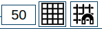
| Setting | Description | Location |
|---|---|---|
| Grid Size | Spacing between grid lines (in mm) | Status Bar |
| Grid Visibility | Show/hide grid | Status Bar toggle |
| Snap to Grid | Align elements to grid intersections | Status Bar toggle |
Using Snap to Grid
When Snap to Grid is enabled:
- New elements snap to nearest grid intersection
- Moving elements aligns them to grid
- Precise positioning without manual coordinate entry
Not implemented yet
To temporarily disable snap while moving, hold Alt key while dragging. This feature is planned for future versions.
Mouse Controls
| Action | Mouse | Modifier |
|---|---|---|
| Select element |  Left click Left click | - |
| Multi-select | Left click | Ctrl |
| Box selection | Left drag | - (with Inspection tool  ) ) |
| Pan view | Middle drag | - |
| Zoom | Scroll wheel | - |
| Context menu |  Right click Right click | - |
| Immediate delete | Left click | Alt (with Eraser tool  ) ) |
Canvas Interaction
Selecting Elements
- Choose the Inspection tool (press Escape or click in toolbar)
- Click on any element to select it
- Selection highlights appear around the element
- Inspector opens showing element properties
Box Selection
To select multiple elements:
- With Inspection tool active
- Click and drag to draw a selection rectangle
Selection behavior depends on drag direction:
- Left-to-right (solid rectangle): selects only elements fully inside the rectangle
- Right-to-left (dashed rectangle): selects all elements overlapping the rectangle
Moving Elements
- Select element(s) with Inspection tool
- Drag to new position
- Release to place
With Snap to Grid enabled, elements align to grid intersections.
Keyboard Movement
Selected elements can also be moved with arrow keys:
| Keys | Step size |
|---|---|
| Arrow keys | 1 px |
| Shift + Arrow | 10 px |
| Ctrl + Arrow | Grid step |
Hold multiple arrow keys simultaneously for diagonal movement.
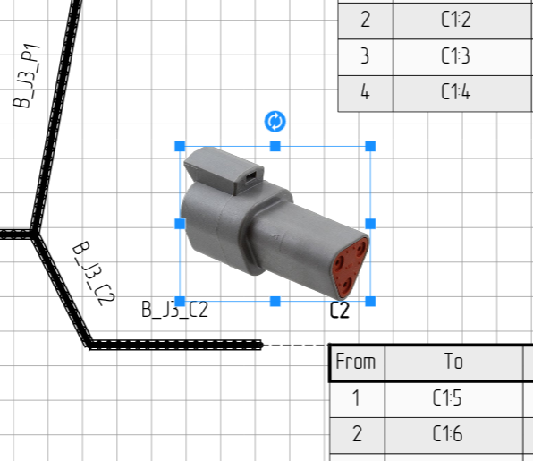
Resizing Elements
Certain element types support interactive resizing via drag handles. When a single resizable element is selected with Inspection tool , blue square handles appear around it.
Resizable element types:
| Element | Handles | Resize behavior |
|---|---|---|
| Rectangle | 8 (corners + edges) | Width and height resize independently |
| Circle | 4 (N / E / S / W) | Radius only — always stays circular |
| Image | 8 (corners + edges) | Scale-based resize |
| Sideview | 8 (corners + edges) | Scale-based resize |
How to resize:
- Select a resizable element with Inspection tool
- Drag any blue handle to resize
- Release to apply
Aspect-ratio lock:
Hold Shift while dragging to lock the aspect ratio:
- Corner handles: both axes scale uniformly
- Edge handles: the axis being dragged controls both dimensions
Circles always resize uniformly regardless of which handle you drag —
there is no need to hold Shift. :::
The handles disappear when you deselect the element, switch tools, or press Delete.
Handle refresh Resize handles and the rotation handle update immediately
whenever you change rotate or scale via the Inspector — no need to deselect and reselect. :::
Rotating Elements
Image and Sideview elements can be rotated directly on the canvas using the rotation handle.
 A selected sideview with blue resize handles at the corners and edges, and the circular rotation handle above the top edge.
How to rotate:
- Select an Image or Sideview element with Inspection tool
- A circular handle with a rotate icon appears above the top edge of the element
- Hover over the handle — the cursor changes to an arc-arrow to indicate rotation mode
- click and drag the handle to rotate the element freely
- Release to apply the new angle
The rotation angle is also editable via the rotate field in the Inspector for precise numeric entry.
Scale along local axes Scale is applied along the element's own (local)
axes, so an element that has been rotated and then scaled will not shear. The shape stays clean regardless of the rotation angle. :::
Connection Feedback
When placing or moving an element near a connectable anchor, all elements attached to that anchor highlight with a red glow. This shows which components and bundles the element will connect to before you release.
Auto-Naming
Elements receive auto-generated names when created (e.g., COMP1, COMP2, W1, BDL1). Names use a prefix plus a sequential number, skipping numbers already in use.
Deleting Elements
Method 1: Eraser tool
- Select Eraser tool (press Delete or click in toolbar)
- Click element to delete
- Or drag to select multiple elements for deletion
Method 2: Quick delete
- With Eraser tool , hold Alt and click for immediate deletion (no confirmation)
Method 3: Keyboard
- Select element(s) with Inspection tool
- Press Delete key
Drawing Area Messages
When you activate a drawing tool, a status message appears indicating the expected action:
| Tool | Message |
|---|---|
| Inspection tool | Choose object to see properties or move, you can use rectangular selection |
| Eraser tool | Choose object to delete, you can use rectangular selection, alt+LMB to immediately delete |
Dimension tool  | Choose dimension start |
Bundle tool  | Choose bundle start |
Line tool  | Choose line start |
Text tool  | Choose text start |
These messages help guide you through the drawing workflow.
Context Menus
click on any element to open its context menu. Available optionsdepend on the element type:
Components are represented by pinouts, sideviews, and wire tables.
click on these shows component options plus element-specificoptions.
| Element Type | Common Actions |
|---|---|
| Pinout | Flip Component, Add Pins, Open Inspector |
| Sideview | Flip Component, Open Inspector |
| Wire Table (caption) | Flip Component, Open Inspector |
| Wire Table (row) | Copy Wire, Open Inspector |
| Bundle | Add/Remove Break, Open Inspector |
| Anchor | Attach All to Anchor, Merge with Another Anchor, Open Inspector |
| Pin (in pinout) | Add Start/End Wire, Remove Wire, Remove Pin, Open Inspector |
| Image | Convert to Sideview, Convert to Splice, Use as Background, Create Sideview |
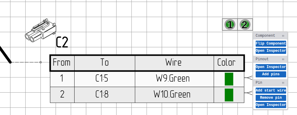 Context menu: Pinout
For a complete reference of all context menu operations, see Context Menu Quick Reference.
Related Topics
- Toolbar - Access drawing tools
- Status Bar - Grid and zoom settings
- Inspector - Edit selected element properties