
Side Menu (Sidebar)
The Side Menu is a tabbed panel on the left side of the interface. It provides access to project management, component libraries, object hierarchy, and visualization settings.

Tab Overview
The sidebar contains 6 tabs, accessed via vertical icons:
| Icon | Tab | Purpose |
|---|---|---|
 | Sheets | Project and sheet management |
 | Library | Component library browser |
 | Objects | Object hierarchy view |
 | Scripts | Script management |
 | Visualization | Layer visibility and display settings |
 | System Settings | System settings |
Click a tab icon to open that panel. Click again to collapse.
Sheets Tab
Manage your project and its sheets.
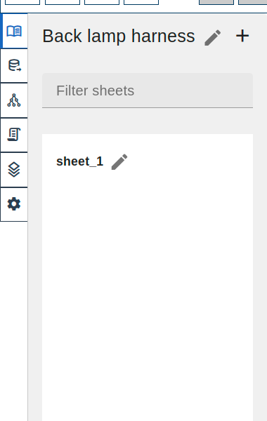
Project Name
At the top of the panel:
- Project name - displayed and editable
- Click the name to rename the project
- Tooltip shows project ID
Creating Sheets
 click the
  button next to project name
- Enter sheet name in dialog
- Click Create
Keyboard shortcut: Ctrl+Shift+N
Sheet List
Below the project name:
- Filter field - type to filter sheets by name
- Sheet list - all sheets in the project
For each sheet:
- Click to navigate to that sheet
- Current sheet is highlighted
- Click name to rename
- Tooltip shows sheet ID
Sheet Operations
| Action | Method |
|---|---|
| Create sheet | click button or Ctrl+Shift+N |
| Rename sheet | click  button button |
| Navigate to sheet | click sheet item |
Library Tab
Browse and place components from your libraries.
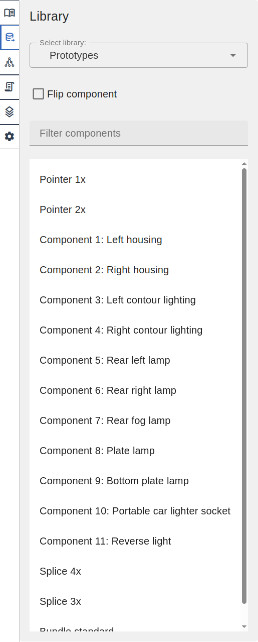
Library Selector
At the top:
- Select library dropdown to choose active library
- Shows all available component libraries
- Type to filter libraries
Add to Library
click the + button next to theLibrary title to create a new component or terminal in the selected library.
The button is disabled until a library is selected.
The dialog lets you:
- Choose whether to use part number as sheet name (default) or enter a custom name
- Click Add new component or Add new terminal to open the corresponding creation drawer
Flip Component
The Flip component checkbox mirrors the component horizontally when placing. Use this when you need the component oriented in the opposite direction (e.g., placing a connector on the left side of the harness instead of the right).
Component List
Below the options:
- Filter components field — search components by name
- Component list — available components in selected library
Placing Components
- click component in list
- Library Component tool
 activates
 - click on canvas to place
Objects Tab
View and manage all objects on the current sheet.
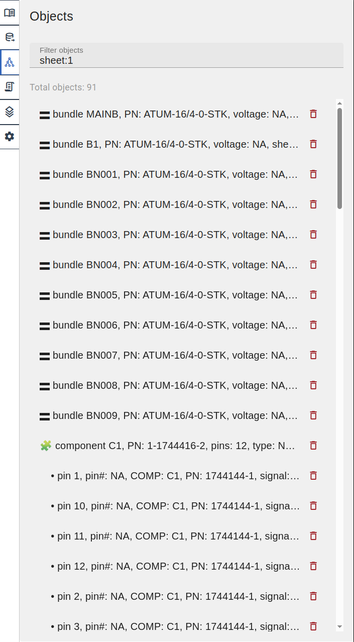
Object List
Displays a flat list of all elements on the sheet. Each object shows:
- Type icon/emoji prefix
- Name and key properties (part number, pins count, etc.)
- Sheet location
- Delete button
 (for deletable objects)
Object types and their prefixes:
| Prefix | Type |
|---|---|
| 🮗 | Bundle |
| ➕ | Bundle Splice |
| 🧩 | Component |
| • | Pin (indented under component) |
| 🔌 | Side View |
| ⚃ | Pinout |
| 🭹 | Wire |
| ◎ | Wire Node |
| ▤ | Wire Table |
| ⚓ | Anchor |
| 📐 | Dimension |
| 💬 | Text |
| 📝 | Comment |
| 🖼️ | Image |
| ⬜ | Rectangle |
| ⭕ | Circle |
| 📏 | Line |
Actions
| Action | Method |
|---|---|
| Open in Inspector | click object |
| Delete object | click button |
Filtering Objects
Use the Filter objects field to search by name or properties. Supports multiple search terms.
Scripts Tab
Manage and execute saved scripts.
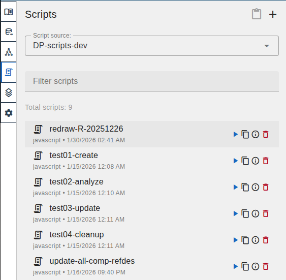
Header
| Element | Description |
|---|---|
| Scripts | Tab title |
 | Paste script (enabled after copying one) |
| Create new script |
Create Script Dialog
click to create a new script: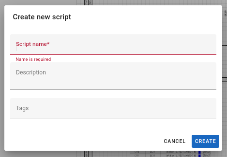
| Field | Description |
|---|---|
| Script name | Required script name |
| Description | Optional description |
| Tags | Optional tags for organization |
Filters
| Element | Description |
|---|---|
| Script source | Dropdown to select current project or library |
| Filter scripts | Search field to filter by name |
| Total scripts | Count of scripts in selected source |
Script Item
Each script displays:
| Element | Description |
|---|---|
| Icon | Script type indicator |
| Name | Script name (clickable to open) |
| Description | Script description |
| Info | Script type and creation date |
 | Run script |
 | Copy script to clipboard |
 | Edit script info |
| Delete script |
Edit Script Dialog
click to edit script metadata:
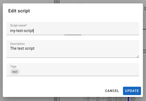
| Field | Description |
|---|---|
| Script name | Required script name |
| Description | Optional description |
| Tags | Optional tags for organization |
| CANCEL | Close without saving |
| UPDATE | Save changes |
Script Details Dialog
click a script name to open the script editor: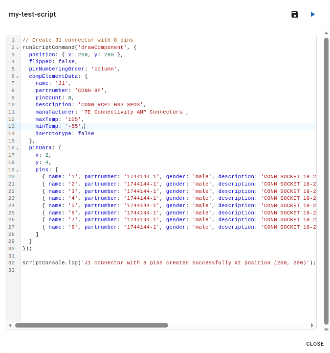
| Element | Description |
|---|---|
| Script name | Displayed in header |
 | Save changes |
| Run script |
| Code editor | Syntax-highlighted JavaScript editor with line numbers |
| CLOSE | Close dialog |
Script Execution
Scripts are JavaScript code that automate LoomCAD operations:
- Create components
- Modify properties
- Batch operations
See AI Chat - Save Script for saving scripts from AI-generated code.
Copy and Paste Scripts
Scripts can be copied between projects and libraries:
- click on a script to copy it to the clipboard
- Switch to the target project or library using the Script source dropdown
- click in the header to paste
The paste button is enabled only when the clipboard contains a copied script.
Visualization Settings Tab
Control layer visibility and display options.
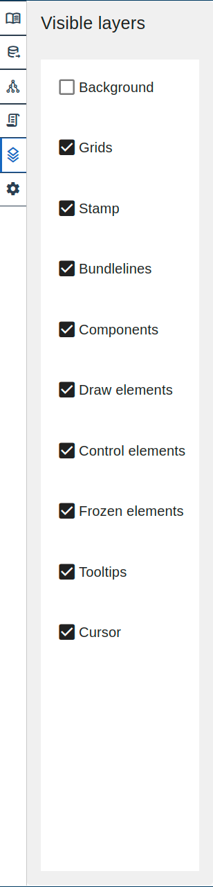
Layer Visibility
Toggle visibility for each layer using checkboxes:
| Layer | Contents |
|---|---|
| Background | Sheet background |
| Grids | Reference grid |
| Stamp | Drawing frame |
| Bundlelines | Wire bundles |
| Components | Connectors, splices |
| Draw elements | Lines, circles, text, images |
| Control elements | Dimensions, anchors |
| Frozen elements | Locked elements |
| Tooltips | Hover tooltips |
| Cursor | Cursor display |
Unchecked layers are hidden from the canvas.
System Settings Tab
System-wide application settings.
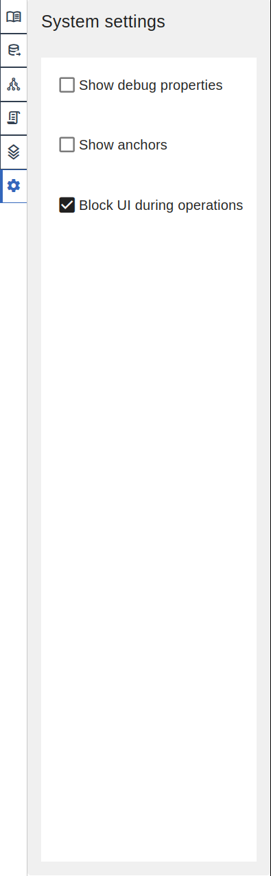
System Settings
| Setting | Description |
|---|---|
| Show debug properties | Display internal object IDs and debug info in the Objects list |
| Show anchors | Display anchor points on the canvas |
| Block UI during operations | Prevent user interaction while background operations are running |
Sidebar Behavior
Opening/Closing
- Open: click any tab icon
- Close: click the same tab icon again, or click on the icon strip (vertical bar with tab icons)
Panel Width
The sidebar panel has a fixed width. Content scrolls if it exceeds the available height.
Persistence
- Selected tab persists during the session
- Tab collapses on navigation to different views