
Object Property Inspector
The Object Property Inspector is a panel that appears on the right side of the interface when you select an element. It displays and allows editing of the selected element's properties.
Opening the Inspector
The Inspector opens automatically when you:
- Select any element on the canvas with the Inspection tool

 double-click an element
- click an object in the
 Objects tab
To close:
- click empty canvas area (deselects element)
- Press Escape with nothing selected
Inspector Layout
Header
- Element type - displays what kind of element is selected
- Element name/ID - identifier of the selected element
Tabs
Some elements display multiple tabs when they have linked objects. For example, selecting a Wire Table shows tabs for Wire table, Component, and Pins.
Property Groups
Properties are organized into collapsible groups (folders):
| Group | Contents |
|---|---|
| coords | x, y coordinates, anchorID |
| scale | x (width), y (height) |
| colors | Array of wire colors |
| style | fillColor, strokeColor, strokeWidth, dashArray |
| textStyle | fontSize, fontFamily, fontWeight |
| pins | Array of pin objects (lazy loaded) |
click the folder header to expand or collapse a group.Action Buttons
Depending on the element type, the Inspector may show action buttons:
- Fetch - import data from external sources (Library, DigiKey, Octopart)
- Apply - confirm changes
- Reset - restore original values
- Save - save changes to library
Property Types
The Inspector uses different input controls based on property type:
| Type | Control | Example |
|---|---|---|
| Text | Text input | Name, description |
| Number | Number input with spin buttons | X, Y coordinates |
| Color | Color picker | Wire color |
| Boolean | Toggle switch | Visibility |
| Dropdown | Select menu | Wire gauge |
| JSON | JSON editor | Custom properties |
Text Properties
- click field to edit
- Press Enter to confirm
- Press Escape to cancel
Number Properties
- Type value directly
- Use arrow keys when focused
Color Properties
- click color swatch to open picker
- Enter hex code directly (#RRGGBB)
- Select from recent colors
Fetch Functionality
The Fetch button imports component data from external sources.
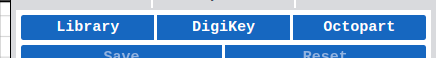
Available Sources
| Source | Description |
|---|---|
| Local Library | Your component libraries |
| DigiKey | DigiKey catalog (millions of parts) |
| Octopart | Multi-distributor search |
Fetch Workflow
- Select a component on canvas
- click Fetch in Inspector
- Choose data source
- Search for component
- Select matching part
- Choose merge mode:
- Merge - add new properties, keep existing
- Replace - overwrite all properties
DigiKey Integration
See DigiKey Integration for detailed setup and usage.
Keyboard Navigation
| Key | Action |
|---|---|
| Tab | Move to next field |
| Shift+Tab | Move to previous field |
| Enter | Confirm value |
| Escape | Cancel edit / Close Inspector |
| ↑ / ↓ | Adjust number values |
Entity Types
The Inspector shows different properties and tabs depending on the selected element type.
Entity Types Overview
| Element Type | Tabs |
|---|---|
| Wire Table | Wire table, Component, Pins |
| Side View | Side view, Component, Pins |
| Bundle Segment | Bundle segment, Bundle |
| Pinout | Pinout, Component |
| Image | Image, Component |
| Anchor | Anchor, Wirenode |
| Splice | Splice, Bundlesplice |
| Component | — |
| Wire | — |
| Pin | — |
| Bundle | — |
| Text | — |
| Dimension | — |
| Line | — |
| Circle | — |
| Rectangle | — |
| Image | — |
| Sheet Wire Table | — |
| Bundle Break | — |
| Stamp | — |
| Script | — |

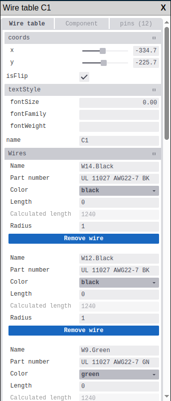
Wire Table
When a Wire Table is selected, the Inspector shows three tabs:
Wire table tab - main properties:
| Property | Description |
|---|---|
| name | Wire table identifier |
| coords | Position on canvas (x, y) |
| isFlip | Mirror the table horizontally |
| textStyle | Text formatting (JSON) |
Component tab - properties of the linked component (see Component)
Pins tab - list of component pins (see Pin)
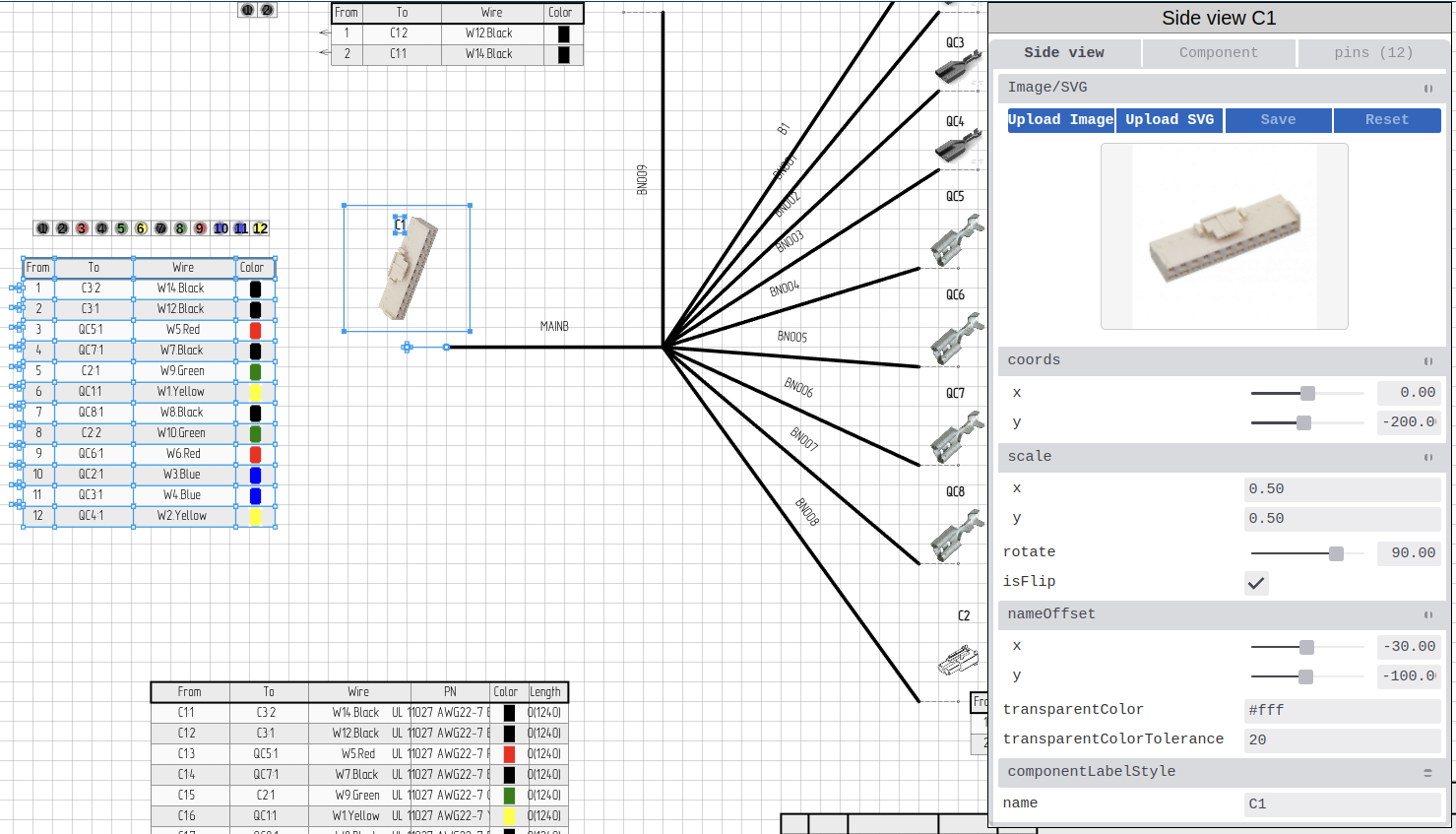
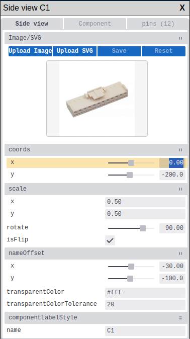
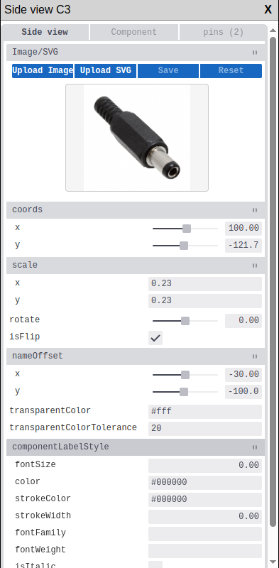
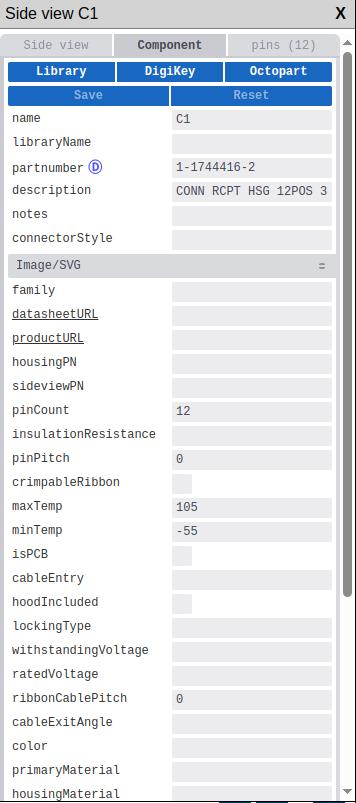
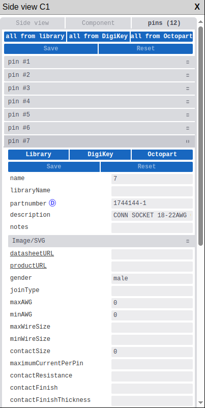
Side View
When a Side View (component image) is selected:
Side view tab - visual representation properties:
| Property | Description |
|---|---|
| name | Side view identifier |
| pathData | Image data (image selector) |
| coords | Position on canvas (x, y) |
| rotate | Rotation angle |
| scale | Width and height scale (x, y) |
| isFlip | Mirror horizontally |
| nameOffset | Label position offset (x, y) |
| componentLabelStyle | Label formatting (JSON) |
Component tab - linked component properties
Pins tab - component pins list
Rotation handle You can also rotate a sideview directly on the canvas by
dragging its rotation handle — the circular icon that appears above the top edge when the element is selected. See Rotating Elements.
Changing rotate or scale here updates the canvas handles immediately. :::
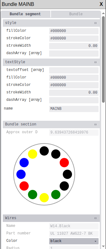
Bundle Segment
When a Bundle Segment is selected:
Bundle segment tab - visual segment properties:
| Property | Description |
|---|---|
| name | Segment identifier |
| coords | Start position (x, y) |
| style | Line style (JSON: fillColor, strokeColor, strokeWidth) |
| textStyle | Label formatting (JSON) |
Bundle tab - linked bundle properties (see Bundle)
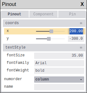
Pinout
When a Pinout element is selected:
Pinout tab - pinout display properties:
| Property | Description |
|---|---|
| name | Pinout identifier |
| coords | Position on canvas (x, y) |
| textStyle | Text formatting (JSON) |
| numorder | Pin numbering order (column/row) |
Component tab - linked component properties
SVG
SVG images are unified under Image. See the Image section below.
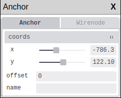
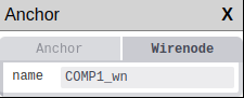
Anchor
When an Anchor point is selected:
Anchor tab - anchor properties:
| Property | Description |
|---|---|
| name | Anchor identifier |
| coords | Position on canvas (x, y) |
| offset | Position offset |
Wirenode tab - appears if anchor is linked to a wire node:
| Property | Description |
|---|---|
| name | Wire node identifier |
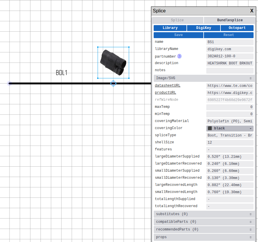
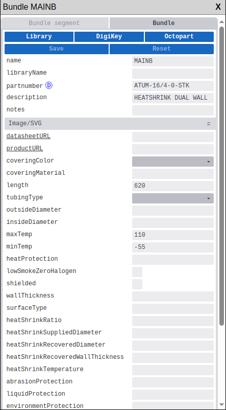
Splice
When a Splice (bundle connection) is selected:
Splice tab - visual element properties:
| Property | Description |
|---|---|
| name | Splice identifier |
| coords | Position on canvas (x, y) |
| pathData | Image (image selector) |
| rotate | Rotation angle |
| scale | Scale (x, y) |
Bundlesplice tab - splice data properties:
| Property | Description |
|---|---|
| name | Splice name |
| partnumber | Part number |
| description | Description |
| coveringMaterial | Material |
| coveringColor | Color |
| maxTemp / minTemp | Temperature range |
 Bundle Splice properties in Inspector
Component
Component properties (shown in Component tab or when selecting a standalone component):
| Property | Description |
|---|---|
| name | Component designator (J1, CON1, etc.) |
| partnumber | Manufacturer part number |
| libraryName | Library component name |
| description | Component description |
| componentType | Connector or Terminal |
| pinCount | Number of pins |
| connectorStyle | Connector style |
| pinPitch | Pin spacing |
| maxTemp / minTemp | Operating temperature range |
| ratedVoltage | Voltage rating |
| color | Component color |
| primaryMaterial | Main material |
| housingMaterial | Housing material |
| imageData | Component image |
| datasheetURL | Datasheet link |
| productURL | Product page link |
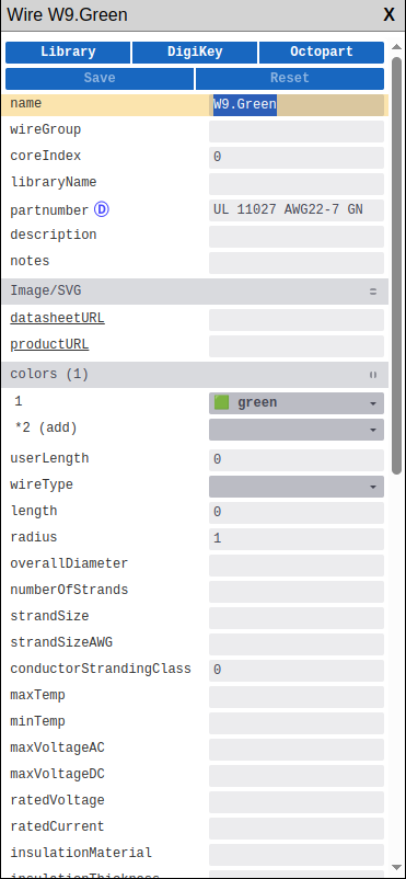
Wire
Wire properties:
| Property | Description |
|---|---|
| name | Wire identifier |
| colors | Wire colors (array) |
| wireType | Type: singlecore, multicore, twisted |
| length | Wire length |
| overallDiameter | Overall diameter |
| maxAWG / minAWG | Wire gauge range |
| maxTemp / minTemp | Temperature range |
| insulationMaterial | Insulation material |
| datasheetURL | Datasheet link |
Pin
Pin properties (shown in Pins tab or when selecting a standalone pin):
| Property | Description |
|---|---|
| name | Pin name/label |
| partnumber | Pin part number |
| gender | Male, Female, or N/A |
| joinType | Connection type |
| maxAWG / minAWG | Wire gauge range |
| contactSize | Contact size |
| contactFinish | Contact plating |
| contactMaterial | Contact material |
| maximumCurrentPerPin | Current rating |
Pins in a component are loaded on demand (lazy loading) when you expand the Pins tab.
Editing Pins:
| Action | Method |
|---|---|
| Rename pin | click pin name, edit |
| Change pin number | Edit number field |
| Set pin type | Select from dropdown |
| Add pin | click  button button |
| Remove pin | Select pin, click  button button |
Bundle
Bundle properties (shown in Bundle tab or when selecting a standalone bundle):
| Property | Description |
|---|---|
| name | Bundle identifier |
| partnumber | Part number |
| description | Bundle description |
| coveringColor | Covering/tubing color |
| coveringMaterial | Material type |
| tubingType | Type: heatshrink, sleeving, conduit, braided, etc. |
| length | Bundle length |
| outsideDiameter | Outer diameter |
| insideDiameter | Inner diameter |
| maxTemp / minTemp | Temperature range |
| shielded | Shielding enabled |
| heatShrinkRatio | Shrink ratio (for heatshrink) |
| datasheetURL | Link to datasheet |
Text
Text element properties:
| Property | Description |
|---|---|
| text | Text content |
| coords | Position on canvas (x, y) |
| rotate | Rotation angle |
| fontSize | Text size |
| style | Text style (JSON: color, fontFamily, fontWeight) |
Text containers support multiline text. Press Enter to add a new line, Ctrl+Enter to submit.
Dimension
Dimension element properties:
| Property | Description |
|---|---|
| name | Dimension identifier |
| coords | Start position |
| coordsEnd | End position |
| leadsize | Leader line size |
| props | Properties (JSON: text, textsize) |
Line
Line element properties:
| Property | Description |
|---|---|
| name | Line identifier |
| coords | Start position (x, y) |
| coordsEnd | End position (x, y) |
| style | Line style (JSON: strokeColor, strokeWidth, dashArray) |
Circle
Circle element properties:
| Property | Description |
|---|---|
| name | Circle identifier |
| coords | Center position (x, y) |
| radius | Circle radius |
| style | Style (JSON: fillColor, strokeColor, strokeWidth) |
Rectangle
Rectangle element properties:
| Property | Description |
|---|---|
| name | Rectangle identifier |
| coords | Position (x, y) |
| width | Rectangle width |
| height | Rectangle height |
| style | Style (JSON: fillColor, strokeColor, strokeWidth) |
Image
Image element properties (covers both raster images and SVGs):
| Property | Description |
|---|---|
| name | Image identifier |
| imageName | Image file name |
| pathData | Image/SVG data (image selector) |
| coords | Position on canvas (x, y) |
| rotate | Rotation angle |
| scale | Scale (x, y) |
| isFlip | Mirror horizontally |
| isBack | Place on back layer |
Component tab — appears if the image is linked to a component (e.g. as a sideview).
Rotation handle You can also rotate an image directly on the canvas by
dragging its rotation handle — the circular icon that appears above the top edge when the element is selected. See Rotating Elements.
Changing rotate or scale here updates the canvas handles immediately. :::
Sheet Wire Table
Sheet Wire Table is a table showing all wires on the sheet.
| Property | Description |
|---|---|
| name | Table identifier |
| coords | Position on canvas (x, y) |
| textStyle | Text formatting (JSON) |
Bundle Break
Bundle Break is a visual marker indicating that the drawn bundle length does not reflect its actual physical length.
| Property | Description |
|---|---|
| name | Break identifier |
| coords | Position on canvas (x, y) |
| style | Style (JSON) |
Stamp
Stamp is the title block of the drawing sheet.
| Property | Description |
|---|---|
| name | Stamp identifier |
| coords | Position on canvas (x, y) |
| fields | Title block fields (project name, author, date, etc.) |
Script
Script element for custom automation.
| Property | Description |
|---|---|
| name | Script identifier |
| code | Script code |